The Honda Edge application began as an internal support tool specifically designed to aid Honda sales consultants. The app underwent an iterative design thinking methodology – and we are now at the third launch.
Through insightful feedback and comprehensive research, we proactively integrated an array of additional tools to enhance support for the Honda teams spanning across North America.
ROLE: UX/UI Designer
DURATION: 3 Years | March 2021 – Present
TOOLS: Adobe XD, Principle, Xmind
Project context
The primary objective of this project is to conduct a thorough exploration of potential areas for improvement within the sales department. It is important to highlight that this project has undergone multiple launches since its inception. Therefore, in the reflections section, I will meticulously delve into the various iterations and explain the decision-making processes that have contributed to its evolution.
Design Process
Followed HCD (Human-Centered Design) process.
Research
Research Synthesis
Ideate & Design
Design Evaluation
Final Design
Understand & Define
Understanding the current state:
Amidst the continually evolving landscape of the automotive industry, the Honda Canada Team sought our expertise to devise a support tool catering to the needs of Honda sales consultants. During the initial client engagement, the automotive sector experienced a temporary slowdown attributed to the pandemic and subsequent supply chain challenges. Drawing upon the preliminary research provided by the client, we discerned a noteworthy correlation: sales consultants who perceived robust support from their teams exhibited the highest sales rates.
Research:
First Launch: The research phase spanned approximately three months and encompassed a comprehensive array of methodologies, including one-on-one interviews, discussion circles, and feedback forms. Given the internal nature of this project, we established a collaborative partnership with the Honda Team, facilitating access to critical stakeholders and individuals who actively engage with such tools on a daily basis. My role was to aid the research team by compiling research and discussion scripts.
Second Launch: As the project advanced through subsequent iterations, we used the qualitative research provided by the Honda analytics team, and the insights garnered from the qualitative feedback and survey features we designed and integrated into the first app launch. By synergizing these inputs with the valuable inputs from one-on-one interviews and group discussions, we effectively advocated for user-oriented changes, further enhancing the tool’s efficacy and user experience.
Third Launch: We worked closely with the internal teams at Honda Canada who contributed information, articles and other content for the app to understand they’re pain points. We honed into they’re process and discovered how we can better provide a seamless experience for them. This research phase included one-on-one interviews, discussion groups and feedback forms.
Challenges:
Throughout the course of our three launches, this project has encountered a series of dynamic challenges that have evolved over time. Three prominent challenges that have been pivotal to address are outlined below:
- Accessibility to Vehicles: The profound impact of the pandemic reverberated across the automotive industry, leading to a significant reduction in vehicle inventory. Consequently, this scarcity posed formidable obstacles for sales consultants, compelling them to navigate an arduous landscape to meet customer demands effectively. We needed to provide further support, to ensure the sales team could create client trust.
- Application Integration: An essential goal for the project was to seamlessly merge the newly developed application with the existing Service Edge application. This integration required meticulous planning and execution to ensure a coherent and unified platform that optimally serves the needs of both sales consultants and service teams.
- Inclusion of Delivery/Handoff Tool: As part of our commitment to enhancing customer experience and internal efficiency, the project aimed to incorporate a delivery and handoff tool. This tool would enable the internal team to seamlessly collaborate and share pertinent information with customers, fostering a streamlined and professional handover process.
In response to these challenges, our team has diligently worked to devise innovative solutions and implement strategic measures to overcome the complexities encountered throughout each launch.
Finding Synthesis | Personas
User experience personas provide valuable insights into the needs, motivations, and challenges of key stakeholders within Honda Canada’s ecosystem. Understanding these personas will guide the design and development of user-friendly tools and digital experiences tailored to meet their specific requirements.
IDEATE
DESIGN GOAL
Through the process of developing our persona, we gained valuable insights into the requirements and challenges associated with the sales and acquisition of vehicles at Honda Canada. As a result, we formulated our research design question.
“How might we support the Honda Edge Sales consultant team with providing simple, easy and accessible information about the available cars so that they can support their customer journey to purchase or lease a vehicle.”
In relation to our research question, we conducted an expedited ideation session to generate practical and viable solutions. Drawing insights from our persona, we crafted a user journey map that outlines a potential experience for prospective candidates. This comprehensive mapping allows for a detailed analysis of various elements within the journey, presenting opportunities for implementation that could potentially:
- Enhance user experience and benefit the user to access information easily.
- Foster efficiency and facilitate smoother processes.
- Provide opportunities for education and feedback.
** User Journey and Site map were completed at this stage.
PROTOTYPING & TESTING
WIREFRAMES
In each design iteration, we begin with low-fi wireframes, using whiteboarding or paper sketches. This step is essential to maintain the intended informational architecture.
Next, we move on to mid-fi wireframes for feature testing and client feedback to ensure their satisfaction.
Finally, based on the input received, we create high-fi wireframes and prototypes for the conclusive stage of user testing.
USER TESTING
HIGH-FI PROTOTYPE
We conducted three rounds of user testing using prototypes of varying fidelity, employing different user testing methods aligned with each round’s specific objectives.
During the initial phase with the lo-fi prototype, we focused on the discovery journey, aiming to gain insights into user perceptions of the experience and their underlying needs. Transitioning to the mid-fi prototype, we assigned users specific tasks to complete and utilized the think-aloud method to gather valuable feedback on enhancing usability. To achieve a comprehensive understanding of user interactions, we recognized the necessity of testing with a functional prototype.
As a result of these testing sessions, we identified three key areas requiring modification:
The integration of the two main app features lacked cohesion, presenting the impression of two separate apps forced together within distinct tabs.
The app’s purpose appeared ambiguous to users without prior knowledge about its functionality.
Insufficient depth was provided for the feature allowing users to choose their identity at the outset of their journey when they first open the app.
In response to these findings, we proceeded to make appropriate adjustments to the prototype.
We have undergone three design and launch iterations for the Honda Edge application tool, each phase detailed below:
- Initial Launch: The first release of the Honda Edge application tool.
- Rebrand and Expansion: In this phase, we incorporated Acura car models to align with the sister company, introduced an education portal, and integrated a service consultant portal.
- Internal/Backend Launch: For the third launch, we focused on internal improvements, integrating the application with Honda Canada’s email CRM and database for effective customer profile logging and tracking.
Please note that throughout these iterations, we have addressed multiple bugs resulting from various iOS and Android software updates, impacting both design and development tools. However, these bug fixes have not been included in the launch explanations provided above.
Steps for Success
Launch 1: Internal Support Tool
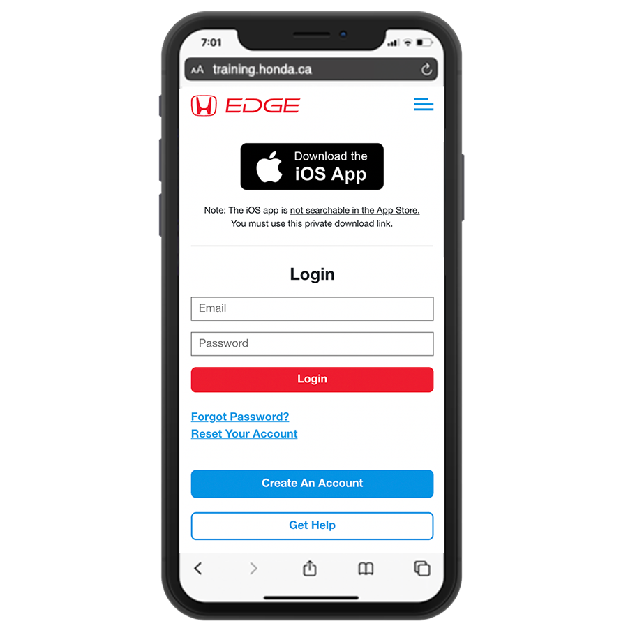
Download
The tool is designed to be accessed exclusively through private identification numbers, ensuring that it remains inaccessible to the general public. This dedicated mobile page facilitates user navigation, directing them to either download the app or seamlessly access it within their web browser.
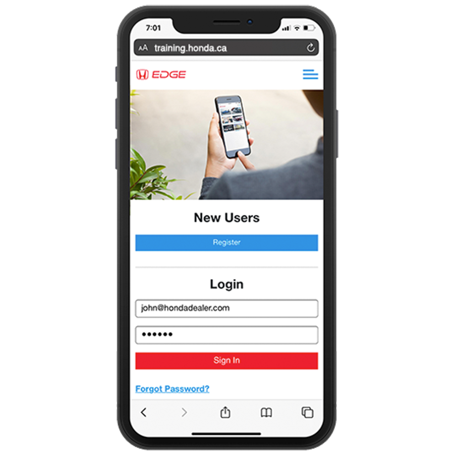
On Boarding | Student ID
The onboarding process is straightforward, offering users two options: to Login or to create an account.
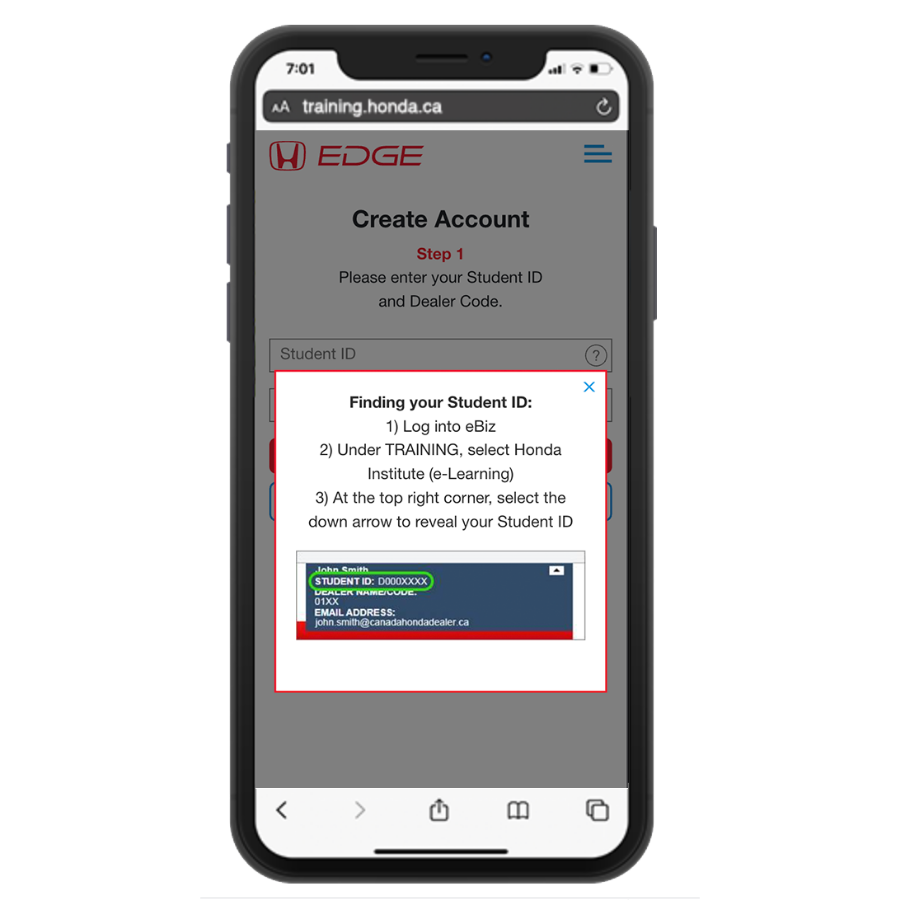
Integrating E-Biz login process
The Honda Team had an established e-learning portal and sought our expertise to seamlessly integrate the login process into their application, aiming to improve user convenience for their staff members. Ensuring the inclusion of relevant informational messaging was imperative to prevent any confusion during the integration process.
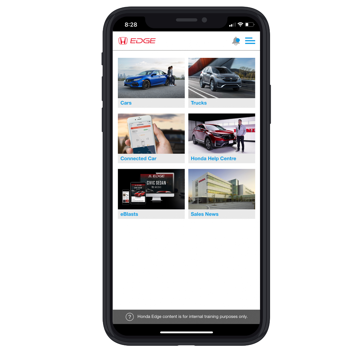
User Dashboard
Upon login or application launch, the user dashboard directed users to a comprehensive selection of tools, designed for easy accessibility to their required functionalities. The clean and intuitive design contributed to a seamless user experience, ensuring straightforward navigation and quick familiarization with the platform's features.
Download
The tool is designed to be accessed exclusively through private identification numbers, ensuring that it remains inaccessible to the general public. This dedicated mobile page facilitates user navigation, directing them to either download the app or seamlessly access it within their web browser.

On Boarding | Student ID
The onboarding process is straightforward, offering users two options: to Login or to create an account.

Integrating E-Biz login process
The Honda Team had an established e-learning portal and sought our expertise to seamlessly integrate the login process into their application, aiming to improve user convenience for their staff members. Ensuring the inclusion of relevant informational messaging was imperative to prevent any confusion during the integration process.

User Dashboard
Upon login or application launch, the user dashboard directed users to a comprehensive selection of tools, designed for easy accessibility to their required functionalities. The clean and intuitive design contributed to a seamless user experience, ensuring straightforward navigation and quick familiarization with the platform's features.

Launch 2: Internal Support Tool
Dashboard
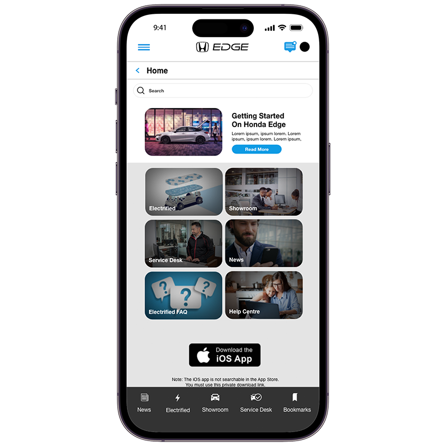
The updated dashboard seamlessly integrated the latest branding changes, featuring a cleaner UI that facilitated the incorporation of both Acura and the service desk portal. Additionally, a prominent headliner section was introduced at the top, enabling the presentation of noteworthy news and updates to users. Moreover, we integrated the Service Desk portal, Electric Cars portal, and a dedicated Help Centre, expanding the platform's functionality and accessibility.
On Boarding | Student ID
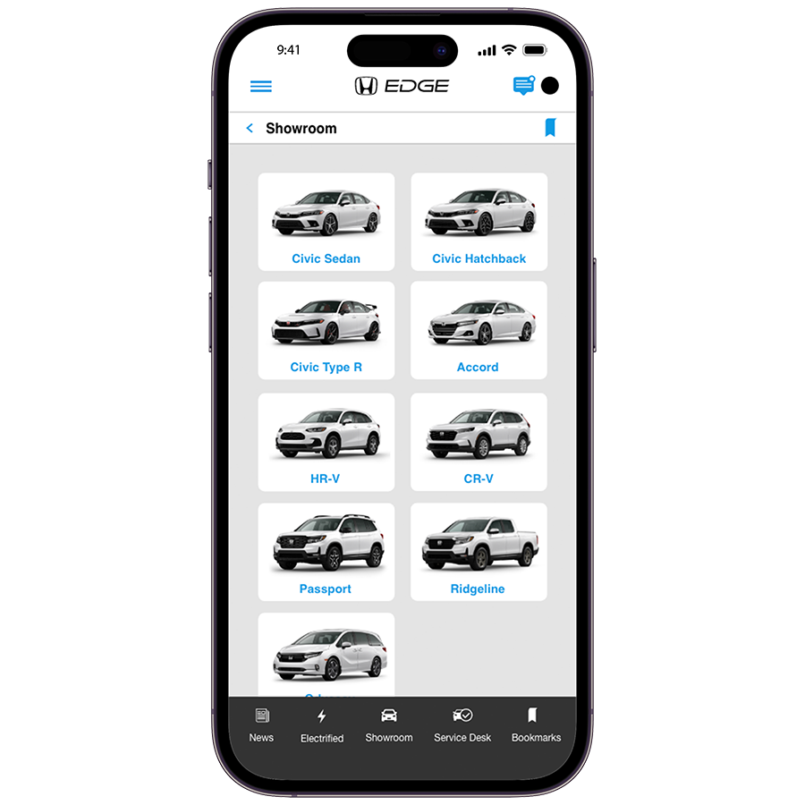
The Showroom page was enhanced with larger, high-resolution images to facilitate easy identification of vehicles by users. Moreover, a user-friendly navigational tool was integrated at the top, providing clear indications of their progress throughout the journey. Additionally, we introduced a bookmarking feature, allowing users to personalize their experience by saving frequently visited sections for quick and convenient access. This bookmarking functionality was thoughtfully implemented across all sections of the website, further enhancing user convenience and satisfaction.
Preparation
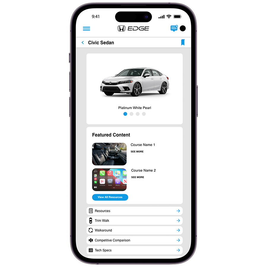
The vehicle information underwent significant improvements, focusing on a clean and concise presentation. These enhancements were guided by a rigorous informational architecture established through thorough research. We prioritized user preferences, identifying the need for featured content and news displayed prominently at the top. Additionally, a comparative comparison and a dedicated section with specific specifications were included to guide users through a comprehensive walkaround. This multifaceted feature served as both a valuable resource tool for seasoned sales consultants and a useful aid for training purposes.
Walk Around Tool
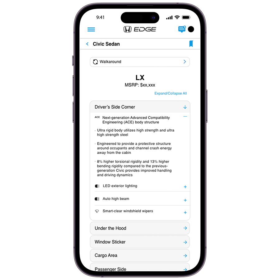
The walk-around feature was meticulously designed to offer users a seamless and detailed outline, ensuring a smooth navigation experience. It seamlessly catered to diverse client needs, presenting both high-level specifications and in-depth information to meet their preferences. The inclusion of comprehensive specs allowed clients to gain a holistic understanding of the vehicles, while the more detailed specifications catered to those seeking in-depth insights and technical information. This carefully crafted feature significantly enhanced the user experience, providing a valuable resource for clients and aiding sales consultants in effectively addressing specific client requirements.
Dashboard
The updated dashboard seamlessly integrated the latest branding changes, featuring a cleaner UI that facilitated the incorporation of both Acura and the service desk portal. Additionally, a prominent headliner section was introduced at the top, enabling the presentation of noteworthy news and updates to users. Moreover, we integrated the Service Desk portal, Electric Cars portal, and a dedicated Help Centre, expanding the platform's functionality and accessibility.

On Boarding | Student ID
The Showroom page was enhanced with larger, high-resolution images to facilitate easy identification of vehicles by users. Moreover, a user-friendly navigational tool was integrated at the top, providing clear indications of their progress throughout the journey. Additionally, we introduced a bookmarking feature, allowing users to personalize their experience by saving frequently visited sections for quick and convenient access. This bookmarking functionality was thoughtfully implemented across all sections of the website, further enhancing user convenience and satisfaction.

Preparation
The vehicle information underwent significant improvements, focusing on a clean and concise presentation. These enhancements were guided by a rigorous informational architecture established through thorough research. We prioritized user preferences, identifying the need for featured content and news displayed prominently at the top. Additionally, a comparative comparison and a dedicated section with specific specifications were included to guide users through a comprehensive walkaround. This multifaceted feature served as both a valuable resource tool for seasoned sales consultants and a useful aid for training purposes.

Walk Around Tool
The walk-around feature was meticulously designed to offer users a seamless and detailed outline, ensuring a smooth navigation experience. It seamlessly catered to diverse client needs, presenting both high-level specifications and in-depth information to meet their preferences. The inclusion of comprehensive specs allowed clients to gain a holistic understanding of the vehicles, while the more detailed specifications catered to those seeking in-depth insights and technical information. This carefully crafted feature significantly enhanced the user experience, providing a valuable resource for clients and aiding sales consultants in effectively addressing specific client requirements.

The third launch of this site has not been included in the portfolio as the design focused on the backend infrastructure for the internal team at Honda. This includes confidential information and modules that I am unable to show.
04 Refelections
Power of iterative design.
Having the opportunity to work on this project for the course of it’s inception has given me a great deal of insight into iterative design. Adapting, changing and leveraging user research to make better design is the beauty of UX Design.
Beyond the application, we got the opportunity to work on email notifications, marketing strategies and internal training videos/documentation.
This project challenged the entire team, we had to actively leverage the research to advocate for changes to the design and ensure our user testing phase was used appropriately. From the beginning, the goal with this project was to ensure we created a product that would and could change easily. And we achieved that.


